UK Disability Survey: our analysis, advice and more
5th March 2021

The media caught wind of a massive issue this week, after the UK Disability Survey was released and almost 100 disability organisations and allies called for the government to scrap the rushed initiative (click here to read the full story from the Disability News Service).
The government have already been forced to extend the deadline to complete this survey, but the main criticisms have been that ministers don’t really want to listen to disabled people or their organisations. The survey itself has access issues, it has over 110 questions (that’s a lot for any questionnaire) and the version of the Microsoft Word document that can be sent out to make it more accessible, cannot be filled out on a screen (!).
About the survey itself
This survey is hard to complete from the point of view of an able-bodied individual. Getting through it was, honestly… very painful, and what we’re about to focus on is scraping the surface. Let’s take a look at some of the issues.
🎬 The intro text
The intro alone is 638 words long; I had a tired finger just scrolling through this text. Using a screen reader on this would be incredibly time-consuming.
This section also includes two videos, both over 13 minutes, and nine external links. If you were to set aside time to read all of this content, it’ll be the best part of an hour to get through this section. And the only way to get to the survey is to get to the bottom of this page.
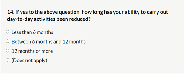
🔤 Question wording
There are multiple examples of the question wording being hard to interpret. We’re going to use a couple of screenshots and other examples from Twitter.
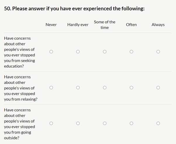
I had to read all of the above a couple of times to understand exactly what they were asking. And it’s not just me, here’s an example from Twitter:

Here is another example.
If the three examples above don’t convince you this isn’t worded well, have a look at the survey itself.
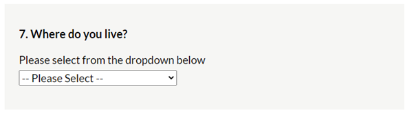
🧰 Question types
Drop-down lists are a massive problem for people with certain motor issues and users of specific assistive technology. Yet, they are frequently used in questions throughout this survey.
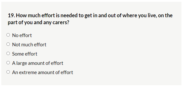
🤔 Ambiguous questions
I don’t think I could answer the following question, especially when I’m being asked to use the same effort measurement for both myself and a potential carer.
Instead of using subjective scales, provide objective options. We posted a blog recently about survey validity where you can find more information and tips on this topic.
🧠 Lack of conditional logic
This may not be the biggest problem with this survey, but it creates unnecessary hurdles for the people completing the questionnaire. For example, users with cognitive impairments or learning difficulties may have a hard time processing questions that are not relevant to them.
🦘 Number jumps
As you progress through the questionnaire, you can see your progress, which is useful. However, when testing the survey, at one point the website showed my questionnaire jumping from question 16 to question 56. This may not sound like a big deal, but can, again, be very confusing.
📶 Show me my progress
Frustratingly, there is no indication of how close you are to finishing the survey while completing it. To add insult to injury, the back button takes you all the way back to the start of the questionnaire instead of taking you back to the previous page.
🦮 Difficult for visually impaired people, poorly built for people with visual impairments
This point was highlighted on the BBC recently: the survey is hard to complete and read for participants with visual issues. A great example is on Molly Watt’s website where you have the option to switch between colours and sizes to make the content easier to read.

🚨 Error messages
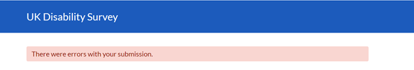
Sure, but what kind of errors? Where did I make a mistake? Can you tell me so I can fix it?
It was at this point that I, an able-bodied participant, gave up.
What is best practice?
Let’s focus on three core areas: the survey’s design, content, and development.
- Design considerations
When your survey and content are designed for all, then you’re more likely to get valid results. Keep the following highlights in mind:
+ Contrast
+ Non colour-reliant information
+ Make links clear
+ Make pages consistent
+ Design for all devices
Content tips
+ Use as fewer and as clear words/sentences as possible
+ Make separate sections clear
+ Make instructions short and clear
+ Use lists and iconography
Development stage
+ Include relevant error messages
+ Use labels and tags appropriately
+ Avoid common tools that do not meet compliance
It’s glaringly obvious that this survey needed the involvement and input of disabled people at the development stage and more thorough testing before its release. The importance of pilot testing cannot be overlooked. Pilot testing allows surveys to be sent to a small segment of an audience to get a clear picture of any problems that may arise later.
There have been a few questions hovering over my head as I was drafting this review of the UK Disability Survey, so bear with me as I answer some of my internal monologue.
The main reason why this has rattled me so much is that surveys sometimes get a bad reputation, and it is surveys like this that do that reputation no favours. It’s frustrating to see a final product being released to the public without the apparent involvement of quantitative research experts and the input of the people it’s supposed to target. This is especially concerning because the results off the back of this initiative are going to affect people’s lives.
There are calls for this survey to be scrapped and completely redone, and although I’m no accessibility expert, I’m going to have to agree.
We covered a lot of best practice in survey design for accessibility in a previous blog post. If you want to talk to experts about accessibility and digital inclusion, you can get in touch with our Accessibility Ambassador, Cathryn Innocent (drop her an email: cathryn@peopleforresearch.co.uk) or follow experts like Molly Watt and Neil Milliken who regularly share fantastic insights.
Jason Stockwell, Digital Insight Lead![]()
If you would like to find out more about our in-house participant recruitment service for user research or usability testing get in touch on 0117 921 0008 or info@peopleforresearch.co.uk.
At People for Research, we recruit participants for UX and usability testing and market research. We work with award winning UX agencies across the UK and partner up with a number of end clients who are leading the way with in-house user experience and insight.